

Choosing a Great Color Scheme for Your Website
Choosing colors for a website can seem a bit overwhelming when you first sit down and start thinking about how you want your design to look. Many designers have a few default color schemes that they know look good but have trouble finding new schemes that work well together. This can either be from lack of experience, inspiration, or simply not knowing exactly what they want for a certain project. For this article, I am going to briefly go over a few techniques that I use to help me decide what the best color choice is for creating an amazing website design.
To start, I always consider what the purpose of the website is in the first place. Is it for a business? Is it an information based website? Maybe it’s a blog? Does the person I am building the website for already have a logo with existing colors in it? Whatever the case, selecting colors based on information you already have is a great way to begin. The three main color areas you should always consider are the following:
1. Choosing a dominant color as your brand color
2. Choosing 1 to 2 accent colors to create a color scheme for your website
3. Choosing a background color to complete your design
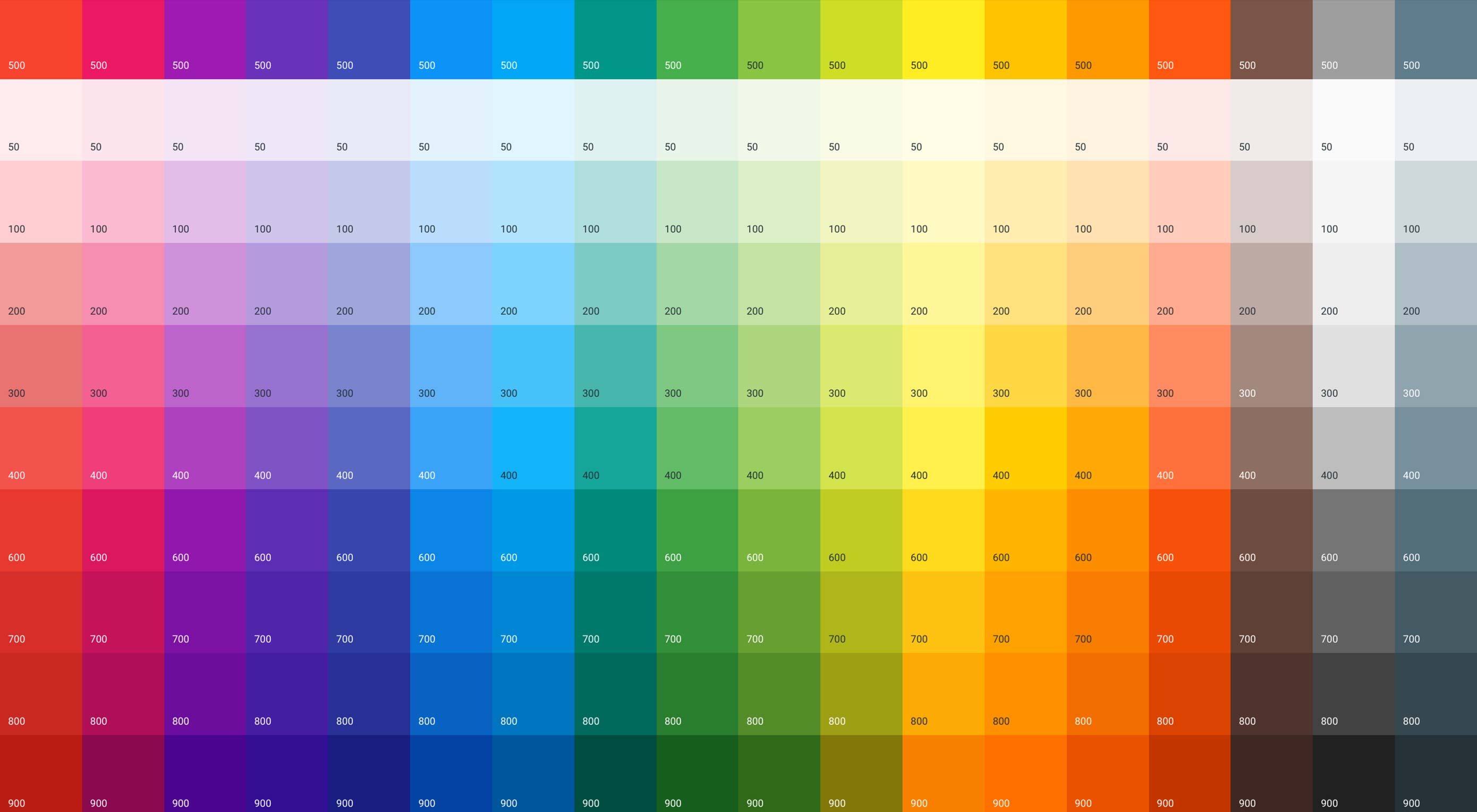
Keep it simple and don’t go overboard with trying to use too many variations of color. Focus on these three main areas and it will be easier to find what combinations work and what doesn’t. To help with this process, there are many different tools available. One that I personally like is from a website called colormind.
Colormind goes beyond the basic color scheme generators and gives you a more in depth color palette when comparing schemes. One great feature that this tool provides is the ability to choose any image you want and their program will create different color schemes based off of that image. This is really handing when you already have a logo or other content created before you start on a design. Colormind also has thousands of default templates to look at and come up with that perfect color combination. I often use the features on this site to help me start thinking outside of my comfort box and find those unique colors that match the overall vibe that I want to come across on my website.
Once you have your colors chosen the next step is applying them to your layout. Take a look at an example of the website I did for a local computer store. As you can see that teal is the featured color on this design. It is also used in the logo as well as some of the titles. Our main accent color is a darker grey. This color can also be found in part of the logo. Remember that everything should work together and match. Lastly we use white for the background and a lighter grey for text. All of the colors blend well together and each serve a purpose. Of course, something we have not talked about that may be of interest to you is color theory. You can learn more about that here.

These tips and tools are just the start and I only very briefly went over a few of the basics to finding that perfect color scheme. I hope this at least helps you along your journey to become a better designer and make things a little bit easier for you in the feature. As always, let me know what you think!